|
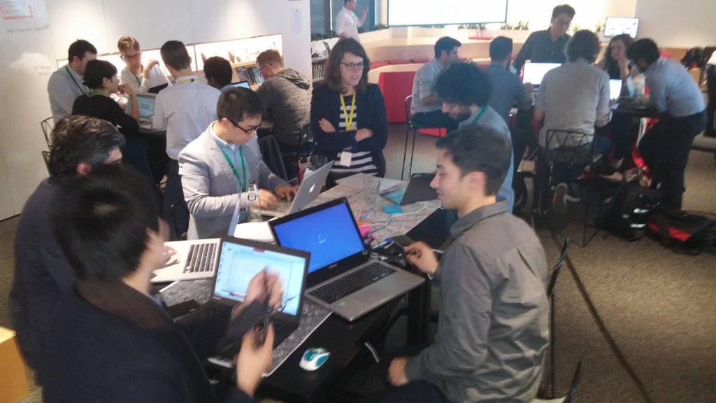
CityX team participated at the ARUP Open Data House as part of the Melbourne Knowledge Week 2016. Arup and a select group of data providers opened up a curated set of rarely seen transport and urban data from Melbourne. Data scientists, city and transport planners, and designers were invited to analyse and help solve a critical urban problem using these exciting data sets.
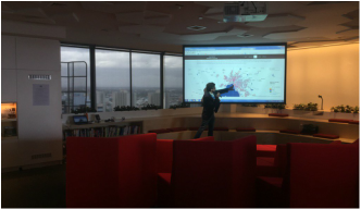
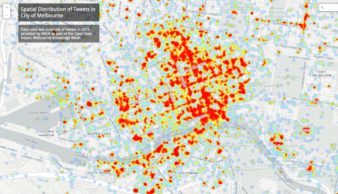
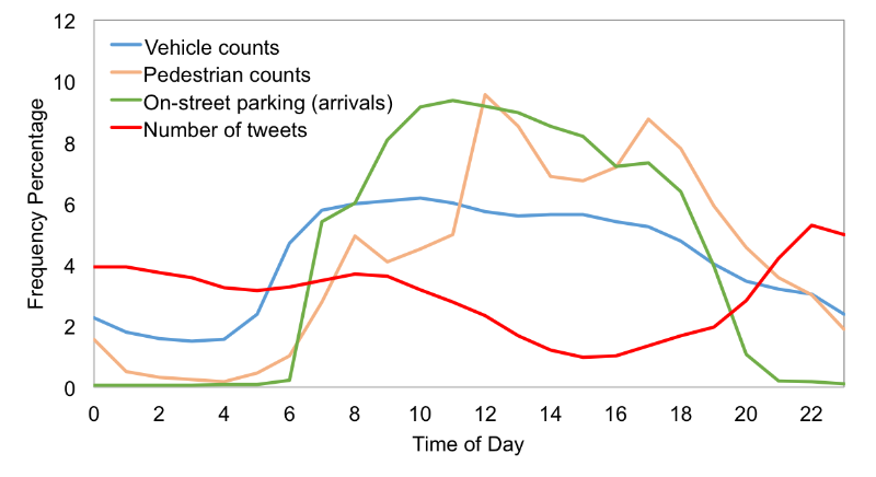
We were invited to present some of our previous data visualizations to inspire participants for a productive afternoon. Later, we also participated in the competition with a project looking at "How do people use the city? Comparing temporal variation of pedestrian activities, on-street parking usage, traffic volumes, and tweets in Melbourne." We put together an imperfect comparative analysis of time-series data from tens of pedestrian count sensors (1.1M+ rows), thousands of in-ground parking bay sensors (1M+ rows), traffic counts from several bluetooth detectors (2M+ rows), and thousands of tweets from Twitter (250K+). The map on the cover shows the spatial distribution of tweets in City of Melbourne. The goal was to better understand how people use the city over time of day using available open data. We were specifically interested to find whether there is any correlation between the temporal variation of some of the data we had. In 2-3 hours, we put together a simple analysis and here are our findings.
Pedestrian activities in the city do not seem to have a strong correlation with vehicle counts and on-street parking usage during the day. While distribution of vehicle counts is decreasing with a small slope from 7 am to 5 pm, pedestrian activities are increasing with three sharp peaks at 8 am, 12 pm, and 5 pm. This is probably due to the fact that a large fraction of people traveling to CBD use public transport.
Special thanks to Bryan, Sajjad, Frank, and Domenico.
0 Comments
Leave a Reply. |
AuthorDr. Meead Saberi, lecturer in transportation engineering, data guru, and urban scientist Archives
May 2019
Categories |
 RSS Feed